The Death of "AI Gibberish": How GPT Image 1.5 Solved the Biggest Flaw in Generative Art
We’ve been faking it for too long Let’s be honest: for the last two years, we’ve been making excuses for AI.
We post these “stunning” images on social media, but we carefully crop out the hands or blur the background signs because we know the text looks like a stroke victim trying to write in ancient Sumerian. We’ve spent more time “fixing” AI hallucinations in Photoshop than actually creating. We called it “AI art,” but it was really just a massive work-around.
Then GPT Image 1.5 dropped yesterday (Dec 16).
I didn’t start by asking for a "cyberpunk cat." I gave it the ultimate stress test: A vintage jazz poster for a club called 'The Blue Note' on 52nd Street. No weird spelling. No "Bleee Noote." It just worked. For the first time, the "AI Gibberish" that’s been plaguing our workflows feels like a thing of the past.
1. Stop treating prompts like code
Remember those 500-word "magic prompts" we used to copy-paste from Discord? The ones full of nonsense like --v 6 --ar 16:9 and five different synonyms for "high quality"?
With GPT Image 1.5, those are officially obsolete. Because it’s natively multimodal, the model actually understands the logic of your request, not just the keywords. If you say, "Put a coffee stain on the contract, but keep the signature readable," it gets the intent. You don’t need to be a "prompt engineer" anymore; you just need to know how to give clear directions to a human assistant.
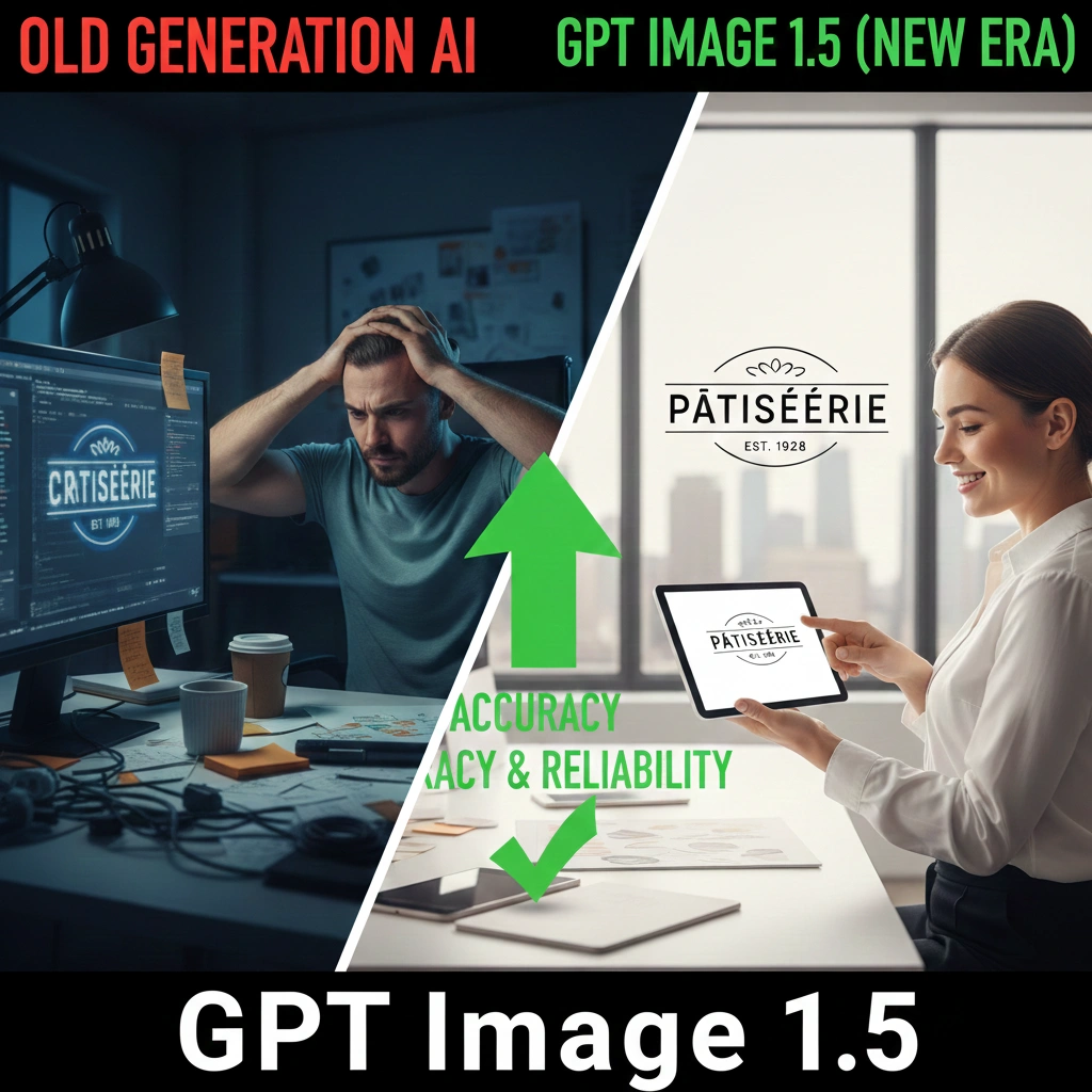
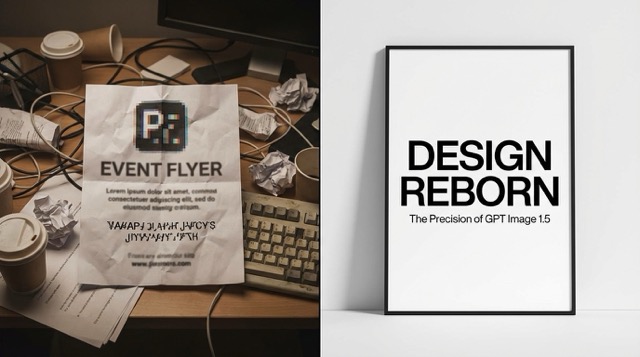 (From "AI gibberish" to professional Swiss design: A side-by-side look at GPT Image 1.5's breakthrough in typographic precision.)
2. It's finally a tool, not just a toy
The biggest shift in 1.5 isn't that the images are "prettier"—it's that they are actually usable in a professional pipeline.
- Real text, finally: You can design a full book cover or an infographic in one go. The text hierarchy is there, the spelling is right, and you don’t need to jump into Canva just to add a headline.
- Surgical editing: Instead of re-rolling the whole image because you didn't like a character's shoes, you can just tell the model to change them. It keeps the lighting, the face, and the background exactly as they were. It treats the image like a layered file, not a random roll of the dice.
- The "Same Face" problem: Keeping a character consistent across ten different scenes used to be a nightmare. Now, it's a standard feature. You can actually build a storyboard that looks like it was drawn by the same person.
3. The Reality Check: 1.5 vs. The Rest
If you're wondering whether to cancel your other subscriptions, here is the honest breakdown of how 1.5 sits in the current market:
| Feature | GPT Image 1.5 | Midjourney v6.x | Gemini 3 |
|---|---|---|---|
| Text Rendering | Flawless. Handles long phrases easily. | Good for short words; fails on long text. | Often "hallucinates" or misses letters. |
| Editing Workflow | Conversational. Just talk to change parts. | Complex. Requires manual "Vary Region." | Intuitive, but lacks deep reasoning. |
| Character Consistency | Built-in. Maintains likeness via memory. | Difficult. Requires complex --cref hacks. | Moderate. Improving but still inconsistent. |
| Iteration Speed | Near-Instant. 4x faster than before. | Slow. Requires waiting for server jobs. | Fast, but workflow feels fragmented. |
- Vs. Midjourney: Midjourney still has that "artistic soul" and better textures for abstract stuff. But for anything involving text or precise placement, 1.5 eats it for breakfast.
- Vs. Gemini 3: Google is fast, but GPT Image 1.5 feels much more "literate." It follows complex, multi-step instructions that usually make Gemini trip over its own feet.
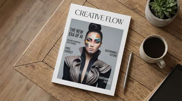 (Complex editorial layout: GPT Image 1.5 effortlessly balances multiple headlines and high-fashion imagery with professional-grade alignment.)
4. Where it still fails
I'm not here to sell you a miracle. GPT Image 1.5 still has its "AI moments."
- The "Clean" Look: Like most OpenAI models, the output can feel a bit too "corporate" or "safe." It lacks the grit and randomness that some artists crave.
- The Finger Struggle: While it’s a massive improvement, don’t expect it to nail a close-up of a professional pianist just yet. Anatomy is better, but it’s not human-perfect.
5. Conclusin
We’ve moved past the era of being impressed by "AI that can almost draw." We’re now in the era of AI that can actually follow a brief.
My challenge to you: Go to ChatGPT 1.5 right now. Don't ask for a landscape. Ask for a magazine cover about your own life, with your name in the masthead and a specific sub-headline about what you did this morning. When you see it render perfectly on the first try, you’ll realize the wall between "AI art" and "real design" just got a lot thinner.