Cornflower Color Palette: 20 Beautiful Combinations with HEX Codes
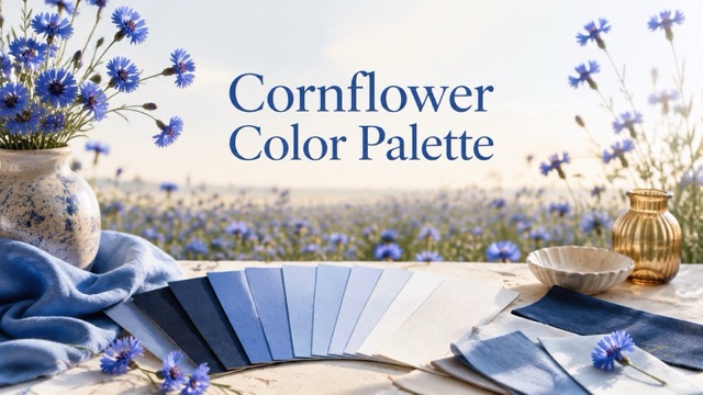
Discover 20 copy-ready cornflower color palettes built around #6495ED. Each combination includes HEX codes, a distinct mood, a recommended use case, and practical advice for applying the colors in real designs.
Cornflower blue is bright enough to attract attention yet soft enough to feel calm. That balance makes it useful across websites, brand identities, social graphics, invitations, packaging, presentations, and interior mood boards. The classic cornflower blue HEX code is #6495ED, a medium-light blue that sits comfortably between airy sky blue and more intense royal blue.
However, one blue cannot create an entire visual system by itself. A successful cornflower color palette also needs supporting neutrals, readable text colors, and carefully chosen accents. The 20 combinations below show how the same blue can feel coastal, romantic, editorial, playful, earthy, or dramatic depending on what surrounds it.
What Color Is Cornflower Blue?
The standard web color known as cornflower blue uses the following values:
- HEX: #6495ED
- RGB: 100, 149, 237
- HSL: 219°, 79%, 66%
- CSS color name:
cornflowerblue
Cornflower blue has more depth than pastel blue but feels gentler than cobalt or electric blue. It is commonly associated with clarity, openness, trust, and calm energy. Its slight violet lean also helps it pair naturally with lavender, blush, berry, and plum.
In web design, remember that #6495ED is a mid-tone color. White text on this blue has a contrast ratio of only about 2.97:1, so it is not a reliable choice for small body copy. Deep ink colors such as #111827 provide much stronger contrast and are usually safer for text, icons, and important labels.
Why Cornflower Color Palettes Work
A cornflower color palette can move between quiet and energetic moods without losing its identity. Three qualities make it especially flexible:
- It works with both warm and cool colors. Pair it with mint, aqua, or lavender for a gentle analogous look, or add amber, peach, coral, or terracotta for contrast.
- It remains noticeable on pale backgrounds. Cream, white, mist gray, and light blue give cornflower room to become the main accent.
- It can feel casual or polished. Soft pastels create an approachable style, while navy, charcoal, cocoa, and wine tones make the same blue feel more mature.
The key is to assign every color a job. Choose one dominant color, one supporting color, one accent, one background, and one text color instead of using all five shades equally.
20 Cornflower Color Palette Ideas
1. Cloud and Ink
HEX codes: #6495ED · #F7F9FC · #D7E3F4 · #1D2A44 · #FFFFFF
Mood: Clear, professional, spacious
Best for: SaaS websites and presentation decks
Use white and cloud gray across large surfaces, cornflower blue for buttons and charts, and deep ink for text. The pale blue-gray creates separation between sections without making the page feel busy. This is a practical cornflower color palette for interfaces that need to look friendly and organized.

2. Honeyed Sky
HEX codes: #6495ED · #F4B942 · #FFF4D6 · #31456A · #F8FAFF
Mood: Optimistic, bright, welcoming
Best for: Travel campaigns and event graphics
Amber gives cornflower blue a warm burst of energy. Let blue lead the composition, then reserve honey gold for a date, badge, call-to-action, or small illustration detail. The pale yellow and off-white keep the pairing sunny rather than heavy.
3. Peach Morning
HEX codes: #6495ED · #FFB89A · #FFE4D6 · #33415C · #FFFDFC
Mood: Fresh, warm, personable
Best for: Lifestyle blogs and personal brands
Soft peach reduces the corporate feeling that blue can sometimes create. Use cornflower for headings and links, peach for cards or decorative shapes, and dark slate for copy. This combination is especially effective when paired with natural-light photography.
4. Sage Garden
HEX codes: #6495ED · #A8CFA6 · #EAF4E4 · #2F4B3A · #FFFDF7
Mood: Botanical, restful, balanced
Best for: Wellness brands and garden invitations
Sage and cornflower blue echo leaves and open sky, producing a natural palette without relying on earthy brown. Use the pale green as a soft background and forest green for type. Cornflower works best as the hero flower color, link color, or invitation border.
5. Lilac Haze
HEX codes: #6495ED · #B8A7E8 · #EDE7FA · #382F5B · #FBFAFF
Mood: Dreamy, graceful, imaginative
Best for: Beauty graphics and creative portfolios
Because cornflower already carries a subtle violet quality, lilac blends with it smoothly. Use the two colors in a restrained gradient or alternating blocks, then add deep plum for readable typography. Plenty of near-white space prevents the pastel combination from looking overly sweet.
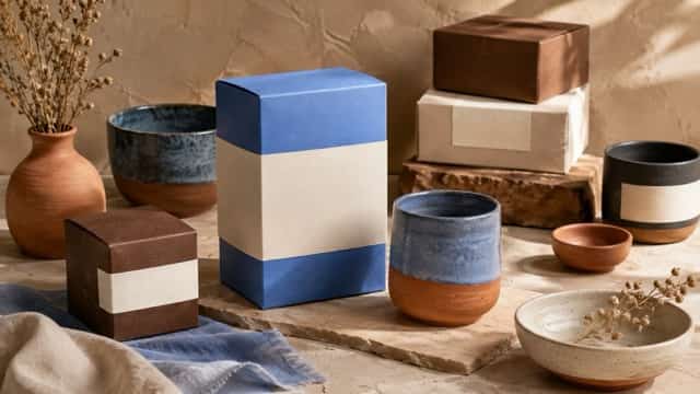
6. Terracotta Studio
HEX codes: #6495ED · #C8755B · #EAD7C9 · #3A3440 · #FFF9F5
Mood: Artistic, grounded, handcrafted
Best for: Ceramics packaging and maker brands
Terracotta is a warm counterpoint to cool cornflower blue. Apply it to tactile details such as labels, stamps, illustrations, or packaging bands. Cream and pale clay should cover most of the design, while blue provides the crisp visual surprise.
7. Midnight Signal
HEX codes: #6495ED · #101828 · #25365F · #C8D9FF · #F8FAFC
Mood: Confident, focused, modern
Best for: Finance dashboards and professional reports
Deep navy turns cornflower into a luminous accent. Use the darkest shade for navigation, data backgrounds, or a presentation cover; add cornflower to selected states and chart highlights. Pale blue can separate secondary information without competing with the main data.
8. Sea Glass
HEX codes: #6495ED · #79C7C5 · #DFF4F1 · #1C4A55 · #F8FFFE
Mood: Airy, clean, refreshing
Best for: Spa websites and coastal branding
Teal gives this cornflower color palette an aquatic direction. Keep most surfaces white or very pale mint, then use blue and sea-glass teal in illustrations, icons, and section dividers. Dark blue-green provides enough weight for headlines and navigation.
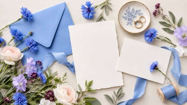
9. Blush Ceremony
HEX codes: #6495ED · #F2B8C6 · #FCE8ED · #4C3651 · #FFFDFE
Mood: Romantic, refined, celebratory
Best for: Wedding stationery and floral branding
Blush brings warmth to cornflower without creating a sharp clash. Use blue for monograms or formal headings, blush for envelopes and floral details, and aubergine for body copy. The palette works particularly well on lightly textured paper.
10. Citrus Notebook
HEX codes: #6495ED · #D7E85B · #FFF6B7 · #272D45 · #F8FAFD
Mood: Playful, youthful, energetic
Best for: Education apps and stationery
Lime-yellow makes the blue feel active and contemporary. Keep the citrus tone limited to progress markers, stickers, tags, or achievement badges. Cornflower can handle navigation and key actions, while dark indigo ensures instructions remain easy to read.
11. Cocoa Editorial
HEX codes: #6495ED · #765548 · #E9DDD5 · #262B3D · #FCF8F5
Mood: Mature, cozy, editorial
Best for: Coffee packaging and magazine layouts
Cocoa and dusty beige soften the digital character of cornflower blue. Use the blue for headlines, links, or one strong geometric element, then let brown appear in photography, rules, and smaller details. Near-black navy keeps the overall design polished.
12. Berry Accent
HEX codes: #6495ED · #A64270 · #F1D4E1 · #2E2545 · #FFFBFD
Mood: Expressive, stylish, bold
Best for: Fashion promotions and social campaigns
Berry adds drama while staying compatible with the violet undertone of cornflower. Use berry sparingly for prices, campaign dates, or featured labels. Blue should remain the dominant brand color, with pale rose acting as the softer supporting surface.
13. Forest and Bloom
HEX codes: #6495ED · #2F6B4F · #BFD8C8 · #243943 · #F7FBF8
Mood: Natural, dependable, restorative
Best for: Sustainable product brands and outdoor guides
Deep green gives cornflower a more grounded identity than mint or aqua. Use green for structural elements and blue for highlights that suggest water, flowers, or open sky. The muted green and soft white keep the palette believable for environmentally focused design.
14. Coral Coast
HEX codes: #6495ED · #F57C73 · #FFD8CF · #173B5F · #F4FBFF
Mood: Social, lively, summery
Best for: Resort graphics and food promotions
Coral creates an immediate warm-cool contrast. Use it for one high-priority element such as a booking button or promotional badge, not every decorative detail. Navy holds the design together, while the pale coral and icy white keep it light.
15. Museum Neutral
HEX codes: #6495ED · #D8D2C8 · #F1EFEB · #2D3038 · #8B6F61
Mood: Quiet, cultured, considered
Best for: Exhibition posters and architecture portfolios
Warm stone neutrals make cornflower blue look like a carefully chosen pigment rather than a standard screen color. Let off-white dominate, use charcoal for type, and place blue in one title block or artwork frame. Wide margins strengthen the gallery-like mood.
16. Neon Dusk
HEX codes: #6495ED · #7B61FF · #36D5F0 · #111827 · #ECF1FF
Mood: Electric, immersive, futuristic
Best for: Music artwork and digital event banners
Violet and cyan push cornflower into a more luminous direction. These colors can form a controlled gradient on a dark background, but typography should remain simple. Avoid adding more saturated accents; three bright cool tones already provide enough energy.
17. Campus Denim
HEX codes: #6495ED · #93AEDC · #E8EEF8 · #2C3E57 · #E5A84B
Mood: Friendly, familiar, trustworthy
Best for: School materials and community platforms
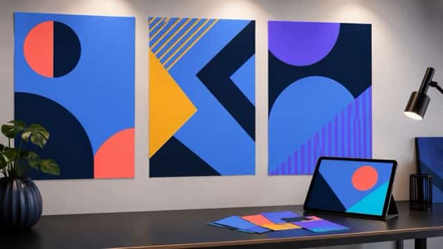
Denim blue creates a comfortable bridge between cornflower and navy. Use amber as a small reward or notification color, not a second dominant hue. This combination feels structured enough for information-heavy layouts without becoming too formal.
18. Monochrome Cornflower
HEX codes: #2F5FBF · #4B7DDD · #6495ED · #A9C4F6 · #E6EFFF
Mood: Cohesive, calm, focused
Best for: Minimal websites and data visualizations
A monochromatic cornflower color palette creates hierarchy through lightness instead of hue. Use the darkest blue for headings, the classic shade for actions, and the two palest tints for backgrounds. Vary spacing, type weight, and scale so the result does not feel flat.
19. Sand and Sea
HEX codes: #6495ED · #D8C3A5 · #F4ECD8 · #25425E · #FFFDF7
Mood: Relaxed, warm, timeless
Best for: Hospitality brands and travel editorials
Sand and cream remove the chill from blue while preserving its open-air quality. Use photography with natural wood, linen, stone, or shoreline textures. Deep marine blue works for text, and cornflower can guide buttons, links, maps, or section titles.
20. Rosewood Contrast
HEX codes: #6495ED · #8C3F4D · #EAC4CA · #2A2E45 · #FBF6F7
Mood: Sophisticated, distinctive, intimate
Best for: Boutique packaging and cultural event posters
Rosewood is deeper and more restrained than bright red, so it gives cornflower a premium contrast. Use the dark wine shade for a single focal point and pale rose for secondary fields. Ink blue keeps the text legible and ties the cool and warm sides together.
How to Choose the Right Cornflower Combination
Begin with the Intended Mood
Decide what the design should communicate before choosing extra colors. Mint and sage suggest calm; peach and blush feel personal; amber and coral add energy; navy and charcoal create authority. A mood word is more useful than selecting colors simply because they look attractive together.
Control the Visual Temperature
An all-cool palette can feel peaceful but distant. Add one warm accent when the design needs more personality or a clearer focal point. Conversely, if photography already contains warm skin, wood, food, or sunlight, a cool cornflower blue may provide all the contrast you need.
Assign a Role to Every Color
A five-color palette does not mean every color needs equal space. A useful starting ratio is:
- 60%: Main background or neutral
- 25%: Cornflower blue or another primary color
- 10%: Supporting shade
- 5%: High-attention accent
Text and functional icons should use whichever dark shade provides sufficient contrast rather than following the ratio mechanically.
Test the Palette in Context
A row of color swatches cannot show whether buttons are clear, text is readable, or photographs fit the system. Apply the palette to one real component—a website hero, poster, product label, or social template—before finalizing it. Test the design on the screen or material where it will actually appear.
Discover New Pairings by Inverting an Image
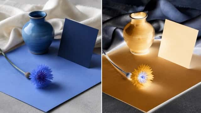
When a cornflower-based photo or design feels too familiar, color inversion can reveal a dramatically different direction. Inverting #6495ED digitally produces approximately #9B6A12, a deep ochre-brown that explains why amber, honey, cocoa, and orange accents create such effective contrast with cornflower blue.
You can invert image colors on an existing photo, poster, illustration, or product image to inspect its reversed light-dark relationships and complementary hues. The result does not have to become the final design. Treat it as a quick color study: identify one or two interesting tones from the inverted image, copy them into a small palette, and then test those accents against the original cornflower blue.
This technique is particularly useful when:
- A monochromatic layout needs one unexpected accent
- A poster lacks a clear visual focal point
- A social graphic looks too similar to previous posts
- You want an alternate “night” or experimental version of approved artwork
- You are teaching complementary color and photographic negative effects
How to Use Cornflower Blue in Real Designs
Websites and Apps
Use cornflower blue for selected states, links, chart highlights, icons, and larger interactive areas. Pair it with pale surfaces and deep text colors. Because small white text does not contrast strongly enough with #6495ED, check every button and label rather than assuming white is automatically readable on blue.
Branding and Packaging
Repeat cornflower in consistent places, such as a logo mark, label border, headline, or seal. Build recognition through placement as well as color. Warm materials and photography can stop the identity from feeling overly digital.
Posters and Social Graphics
Choose one contrasting accent and use it for the most important message. If cornflower fills the background, a deep navy or near-black headline will usually read more clearly than thin white lettering. Bright accents are most effective when they occupy a small area.
Invitations and Editorial Layouts
Cornflower works beautifully as a hero ink on cream or lightly tinted paper. Combine it with blush, sage, taupe, or muted terracotta for decorative elements. Keep long paragraphs in charcoal, plum, or navy to protect readability.
Interior Mood Boards
Translate HEX colors into material references instead of expecting paint, fabric, and screens to match perfectly. Cornflower can appear in upholstery, ceramics, art, or one painted feature, while sand, cream, oak, and stone provide a stable base.
Cornflower Color Palette FAQs
What Is the HEX Code for Cornflower Blue?
The common web and CSS value for cornflower blue is #6495ED, with RGB values of 100, 149, 237. Other color systems and paint collections may use the same name for slightly different shades, so keep the exact code attached to digital brand files.
What Color Complements Cornflower Blue?
Warm yellow-orange tones provide the strongest contrast. Amber, honey, ochre, coral, peach, terracotta, and muted orange can all complement cornflower blue. Choose a softer or darker version of the warm color when you want a more refined result.
What Neutral Colors Go with Cornflower Blue?
White, off-white, cool gray, cream, sand, taupe, charcoal, navy, cocoa, and near-black all work well. Cool neutrals create a crisp digital look, while warm neutrals make cornflower feel more tactile and welcoming.
Is Cornflower Blue Suitable for a Brand Color?
Yes. It is noticeable without being aggressive and can support calm, approachable brand identities. A complete brand system should also define dark text colors, pale backgrounds, secondary shades, accent colors, and accessible interaction states.
Can Cornflower Blue Be Used in a Monochromatic Palette?
Yes. Combine deep, medium, light, and very pale versions of the same hue. Create hierarchy with contrast, spacing, type size, and shape rather than introducing unnecessary accent colors.
Is White Text Readable on Cornflower Blue?
Not always. White against #6495ED has a contrast ratio of about 2.97:1, which is too low for standard-sized text under common accessibility guidelines. Use a deep ink or navy color for smaller text, or darken the blue background and verify the final combination with a contrast checker.
Build a Palette That Has a Clear Job
The best cornflower color palette is not simply the one with the prettiest swatches. It is the one that directs attention, supports the intended mood, works with the content, and remains readable in its final environment.
Start with #6495ED, select a background and text color, then add only the supporting shades your design actually needs. Whether you choose sage, blush, coral, cocoa, navy, or amber, give every color a clear role. That small amount of discipline allows cornflower blue to remain recognizable while adapting to many different creative styles.